

Art in Rich-Prospect: Evaluating Next-Generation User Interfaces for Cultural Heritage
Christopher Morse, University of Luxembourg, Luxembourg, Vincent Koenig, University of Luxembourg, Luxembourg, Carine Lallemand, Eindhoven University of Technology, The Netherlands, Lars WIENEKE, University of Luxembourg, C2DH, Luxembourg
Abstract
The present study reports on the user experience (UX) of rich-prospect browsing, an emerging interface design trend for digital cultural heritage. Building on research that suggests online museum collections are used only infrequently by the general public, this study investigates the role of next-generation user interfaces in the design of optimal browsing experiences. Moreover, it describes the results of user testing for three different arts and culture collections that make use of rich-prospect. The study recruited 30 participants of varying ages, nationalities, and museum visiting habits to discuss their museum experiences and test three different applications: Coins, Curator Table, and Museum of the World. The results of the study provide insights into the user experience of a new browsing medium and reveal the information-seeking habits and patterns that occurred within these information environments. Moreover, the study isolated the core features of rich-prospect in order to define opportunities and pain points during the browsing experience and indicated which features in particular are most important to people during the browsing experience. Finally, we suggest some best practices going forward in the design of rich-prospect.Keywords: digital cultural heritage, museum interfaces, user experience, human-computer interaction, rich-prospect, browsers
Introduction
Rich-prospect browsing is an emerging trend in the design of user interfaces for cultural heritage collections. Proposed by Ruecker et al. (2011), rich-prospect browsers embody new approaches to the visualization of digital archives and the development of novel interactions therein. However, in spite of this trend, museum interfaces struggle to create the same kinds of novel and meaningful experiences that engage museumgoers during an in-person visit (Petrelli, 2013). Furthermore, there exist few studies that document the user experience (UX) of rich-prospect browsing in the context of modern cultural collections (Windhager et al., 2018).
The following study investigates the user experience of rich-prospect browsing in order to understand how it can be used to design optimal browsing experiences around museum collections. It evaluates the individual UX of three separate interfaces in the context of the core features of rich-prospect, described in the study as: representation, organization, depth, availability, multiplicity, coherence, and selection.
During the study, participants were invited to the University of Luxembourg User Lab to test the three different applications: Coins, Curator Table, and Museum of the World. After a short interview about museum experiences, both analog and digital, participants used the three applications to explore different arts and culture collections. Throughout their interactions with the applications, participants described their experiences using the think aloud technique in order to provide in-the-moment feedback.
Rich-Prospect Browsing
The conceptual framework informing the design of rich-prospect browsers is based on the notions of prospect and affordance. Defined originally by Appleton (1975) in his work on the aesthetic appreciation of landscapes, prospect occurs when an individual is able to see the lay of the land before them, or in this case, a representation of the entirety of a museum collection in a single browser window, and through that overview, discern the essence of the landscape or the museum collection. Together with Gibson’s (1979) work on affordances, which represent actionable possibilities by a user within a given environment, Ruecker et al. (2011) outline the rich-prospect browsing interface theory.
They assign seven principles of interaction common to rich-prospect browsing. Although these seven principles were not given formal names in the text, for the purposes of the study we proposed the following names: representation, organization, depth, availability, multiplicity, coherence, and selection. The seven features and corresponding names are listed in Table 1.

Rich-prospect browsing was designed to address the growing abundance of digital cultural collections, comprising both digitized objects and born-digital materials. Ruecker et al. (2011) argue that providing a wealth of well-designed visual information offers a more optimal experience than artificially or arbitrarily restricting content. The restriction referred to here is the notion of cultural heritage content accessible only through traditional keyword search and is best illustrated by Whitelaw’s (2015) metaphor of the art gallery attendant only allowing visitors to view art that they are able to query from the lobby.
The search bar, argues Whitelaw (2015), cannot possibly represent the abundance and increasing ubiquity of our digitized cultural heritage. In contrast, rich-prospect allows a database or archive to express its full richness to the user at first glance, while simultaneously providing new opportunities for depth and increasingly granular interactivity. As such, rich-prospect browsing has the potential to inspire new information-seeking behavior and can be used as a framework through which designers and cultural heritage professionals can describe and develop sophisticated user interfaces to mediate between user and content.
Related Work
Information-Seeking Behavior
A precursor to rich-prospect browsing originated in the work of Shneiderman (1996), whose reflections on information design and visualization led to the development of his visual information-seeking mantra: overview first, zoom and filter, then details on demand. This mantra describes an underlying movement from macrocosm to microcosm, where the user sees a collection or archive in its entirety laid out in space before diving into the details.
Whitelaw (2013), who pioneered the notion of interface generosity, argues for a similar set of features: 1) show first, don’t ask, 2) provide rich overviews, 3) provide samples, 4) provide context, and 5) share high-quality primary content. In other words, generous interfaces should volunteer information to users rather than soliciting them for it. Thereafter, the interfaces should maintain context throughout use, meaning that users should always understand where they are and how they got there during their exploration.
Dörk et al. (2011) present a more recent addition to modern information-seeking behaviors with the archetype of the information flaneur, which approaches information-seeking in the form of exploration, serendipity, and curiosity. The flaneur exists within two dimensions: horizontal exploration (exploring information, gaining an overview, following one’s curiosity) and vertical immersion (making sense of information, seeing the details, engaging in pleasurable experiences), and it is within the rich-prospect browsing context or Whitelaw’s generous interfaces that the flaneur finds its home.
Evaluation of Digital Cultural Heritage Applications
Early prototypes of rich-prospect browsers served to inform the development of the features as they are known today. Given et al. (2007) report on the user experience of a pill-identification browser designed to ease the complexity of navigating Drugs.com. Their study found that senior citizens often experienced cognitive reassurance from the representation of 1,000 pills displayed all at once, even in cases where the participants did not discover the filtering tools to navigate more deeply. A later study by Giacometti et al. (2008) on the Texttiles browser, which featured collections of images and text, discovered the necessity to communicate meaning behind the visual organization of images, which we might refer to as the coherence feature, as well as the need to be able to mark items to return to them throughout the browsing experience, which we refer to as the selection feature.
Many modern digital collections are built into museum website infrastructures. Understanding the relationship between museum websites and its users has, therefore, become an increasingly active area of study in this regard. Fantoni et al. (2012) conducted a series of studies on user motivations for visiting the Indianapolis Museum of Art website. Their results outlined visitor behaviors and reasons for the visit but did not focus specifically on interactive systems for digital heritage. Their study did, however, reveal that only a small percentage of users performed art searches (approximately 4.3% of the 4,074 respondents), suggesting that interactive museum galleries were not very popular.
MacDonald (2015) posited that the lack of interest in online digital collections from the general public originated in part from poor UX, citing the aforementioned study and another from Haynes & Zambonini (2007), which showed that museum visitors were primarily interested in the visiting hours page rather than searching for art. In response, MacDonald designed a UX-based rubric to evaluate websites with digital museum collections. His rubric features three categories based on the emotional design model adapted from Norman (2004): visceral, behavioral, and reflective. The rubric looks at the entirety of the system and its overall experience, which has potential for prototypes and near-finished products, but does not isolate particular features specific to rich-prospect.
More recently, Kabassi (2017) published a review of evaluation experiments on museum websites designed with cultural heritage professionals in mind. Although interactive systems are included within the survey, they do not include the rich-prospect browsing context. Koutsabasis (2017) published a more targeted review of interactive systems in cultural heritage, which focused primarily on serious games, mobile applications, and virtual reality reconstructions.
Finally, the most recent survey publication on designing for visual collections in cultural heritage was published in 2018 by Windhager et al. Their results showed that out of 50 reviewed papers on visualized cultural heritage, only 21 mentioned user studies. Among those, five did not report any results. Moreover, only a portion of the remaining papers were designated for non-expert users. This suggests that user studies are significantly lacking overall in the development of next-generation user interfaces for cultural heritage.
Methodology
Participants
We recruited adult participants (N = 30) in Luxembourg and the surrounding area over the course of two and a half months. Participants received a gift voucher in compensation for their efforts to join the study. Altogether the participants represented 17 different nationalities and were between the ages of 19 and 70 (M = 34.4, SD = 11.76). We interviewed them about their museum-going habits, their in-person exposure to digital artwork or exhibitions at museums, and how frequently they accessed digital cultural heritage collections. Finally, all participants selected a museum persona that most closely fit their typical museum behavior. These were adapted from Falk (2006), whose museum personas are closely linked to the experiential and self-referential nature of the museum visit. In order to help participants more easily self-identify with a particular type, the persona characteristics were converted into first-person perspective (Table 2).

The majority of participants identified as the Explorer (n = 16), followed by the Professional / Hobbyist (n = 8), and the Recharger (n = 5). Only one participant chose the Experience Seeker, and no one chose the Facilitator.
Interface Selection
In order to investigate the user experience of rich-prospect browsing from the perspective of its primary features, it was necessary to select digital arts and culture applications that made sufficient use of the relevant functionality. Rich-prospect browsers are rarely, if ever, explicitly advertised under that name, but are nevertheless of increasing interest among institutions of cultural heritage (Hinrichs et al., 2016). In the end, three interfaces were chosen: Coins, Curator Table, and Museum of the World.
The choice of interfaces was intended to provide a diverse experience for rich-prospect browsing contexts. The three applications represent different digital collections: numismatics, fine art, and archaeology. All fall within the scope of cultural heritage and are visually depicted through varying layouts and interaction styles. This allows users to experience the seven primary features of rich-prospect browsing within the scope of different information environments.
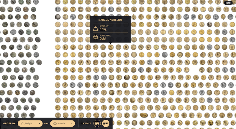
Coins features over half a million coins and medals from Münzkabinett Berlin, one of the largest numismatic collections in the world. The interface allows users to explore the collection using a series of filters ranging from time period to minting place to material. Its varied layouts and organizational options provide an exploratory browsing experience designed to recreate the experience of playing with coins as a child.

Curator Table is a Google Arts & Culture experiment featuring artworks from over 600 museum partners across the world. The interface presents users with a digital collage of images representing the contributions of its partner institutions. Users can zoom and pan across the collage or engage the search bar and resulting metadata functionality to organize the images based on artists’ names, objects depicted, and institutions.

Museum of the World is the result of a collaboration between The British Museum and Google Cultural Institute. It is an interactive geographical timeline featuring objects from The British Museum’s collection spanning over two million years from prehistory into the present. The interface was built using WebGL, a JavaScript API designed to render interactive 3-D graphics within the browser. Its collection spans multiple continents and includes objects as diverse as a Han Dynasty lacquer cup to Nigerian rock art, and is therefore, perhaps the most diverse among the three interfaces.
Procedures
All user testing was conducted within the User Lab at the University of Luxembourg. The three rich-prospect applications were accessed via an Apple iMac belonging to the lab which ran Google Chrome (v. 70.0.3538). All participants consented to being recorded during the session, which included the computer screen.
After the initial interview about museum experiences and frequency of use of digital collections, participants were instructed to access a pre-assigned interface (Coins, Curator Table, or Museum of the World) from the Chrome bookmarks toolbar. We recruited thirty participants in order that each of the interfaces would have ten dedicated users chosen at random. There were two simultaneous tasks:
1) Explore the application and discover items of interest to you.
2) Narrate your experience as you use the application.
Regarding the first task, it was important for participants to test the application in the context of browsing and discovery rather than a traditional search-based approach, which is part of the ethos of the rich-prospect context.
Participants tested the application for ten minutes and then briefly described their impressions after the researcher returned to the room. They were then instructed to fill out an AttrakDiff survey to measure the overall user experience of the application.
The AttrakDiff (Hassenzahl et al., 2003) is a standardized questionnaire featuring four sub-scales across seven items each, totaling 28 items altogether. Each item comprises a pair of opposing words (e.g. good/bad; unimaginative/creative) separated by a seven-point scale. The survey measures the pragmatic quality (PQ), usability from the perspective of accomplishing a particular goal or task, hedonic-stimulation quality (HS-Q), how well the application fulfills the stimulation needs of the user, hedonic-identity quality (HI-Q), how well the application allows the user to relate to it, and finally global attractiveness (ATT), which measures the overall value in regards to both pragmatic and hedonic qualities.
Participants also received a rich-prospect browsing survey, a 7-point Likert questionnaire designed to describe how well each of the seven primary features supported engagement with the collection (Table 3). Each item in the questionnaire represents one feature of rich-prospect and gauges its ability to provide an optimal browsing experience from the perspective of familiarity with the collection, finding objects of interest, and interacting with them. The questionnaire was developed by the researchers and pilot tested to connect each question to a respective feature as closely as possible while avoiding overly technical language for the sake of comprehensibility.

Thereafter, the researcher briefly introduced the seven features of rich-prospect browsing to the participant, explaining that the different arts and culture applications they would be using during the session made use of these features to some extent. The researcher displayed seven printed cards with icons to represent each feature as well as an associated description (Figure 4). After exposure to the seven features, participants accessed the next two applications for ten minutes each. The original tasks of browsing for interest and thinking aloud continued throughout the testing of the other two applications, and after each application, the researcher would briefly return to discuss participant impressions. The participants did not fill out any additional materials during this time. As such, participants were exposed to all three applications but only reported on the first.

The session concluded with two activities. First, participants received a grid with the seven rich-prospect browsing features followed by the names of the three applications they tested. They were instructed to read each feature (e.g. representation) and circle the interface they felt best represented that feature (e.g. Coins). This activity was an opportunity for the researcher to reintroduce the features to participants in order to reinforce their particular characteristics and to answer any questions the participants had about their individual meanings.
Finally, participants were asked to order the seven feature cards from least important to most important in the overall context of their browsing experiences. The researcher recorded the final layout (least important = 1; most important = 7) and prompted the participant to explain briefly why they chose that particular order.
Results
The User Experience: AttrakDiff
The results of the AttrakDiff survey (Figure 2) demonstrate a positive user experience for both hedonic-stimulation (HQ-S) and hedonic-identification (HQ-I), which indicate an overall feeling of relatedness and stimulation from the use of each application. Museum of the World scored particularly well in HQ-S and HQ-I, which suggests that the participants felt engaged. In particular, many participants reacted positively to the audio option in Museum of the World that featured curators from the British Museum describing objects in the collection. One participant noted that the combination of features “draws you in,” and another described the opening animation as very impactful.
The global attractiveness (ATT) scale also scored positively; however, in the pragmatic quality (PQ), the scores of all three applications fell with Curator Table descending into the negative. This suggests that the pragmatic aspect of the experience is a pain point to some extent for all three applications.

Issues of practicality are not altogether surprising. During the user testing, one participant remarked that the Coins interface “is interesting, but seems impractical.” Another participant using Museum of the World said that “everything is there but nothing is there,” suggesting that so much was being presented that it gave the impression that no single thing was actually showcased. For users of Curator Table, there was a great deal of frustration around the progressive loading of artwork which was at times slow, especially after performing an image search. Participants also questioned what the Curator Table was trying to represent with its introductory view of the entire collection. One person described the overview as a map, another as a landscape, another as chaos. It is likely that this uncertainty contributed to the lower pragmatic quality score.
The User Experience: Rich-prospect Browsing Survey
The results of the rich-prospect browsing survey provided additional information about how successfully each of the seven features familiarized the user with the collection or its navigation and use.

The results are visualized in Figure 6. For each feature on the graph, Table 2 provides the associated survey question. In short, agreement with a question resulted in a positive score, whereas disagreement resulted in a negative score. Therefore, positive values suggest that users found the feature helpful in their experience of the application, and negative values suggest the feature was not helpful or absent.
In this case, the application of rich-prospect within Curator Table often did not generally support familiarity with the collection or its use. In contrast, Museum of the World and Coins scored generally in the positive, with a few exceptions in the case of Museum of the World. As was previously described, participants often reacted positively to the curated audio feature built into Museum of the World, and this may explain why the browser scored so well in depth. In addition to viewing text and images, participants could also hear from the experts themselves. In all three instances, however, more could be done to increase the overall usability of the applications in the context of rich-prospect functionality.
Information Pathways
Finally, participants were asked to rank the seven features they were exposed to during the user testing. These rankings were not based on the individual applications themselves. Instead, we asked participants to consider the rich-prospect browsing features in general, and then ranked the features from least important to most important to them (1 = least important; 7 = most important). This information provided insight into which features were perceived as most effective or useful irrespective of the applications used. The mean rankings are visualized in Figure 4, based on the individual interface groups. That is to say, the rankings are grouped based on which browser the participants used first (three groups of ten participants each).

The mean rankings conform to an overall pattern across the features with some additional variation in the case of Museum of the World. The most variation occurs in representation, organization, and selection. Nevertheless, this similar pattern across all three groups suggests that the application first used by each participant (before they were exposed to rich-prospect more formally) likely did not influence their final ranking.
When the results of the rankings are viewed across the entire sample (Table 4), additional patterns emerge.

Table 4 shows a mean ranking and standard deviation across the entire sample. In addition, it shows how often each feature was ranked within the top 3 (rank = 5, 6, or 7) and how often it was ranked most important (rank = 7). The three features with the highest ranking are highlighted in increasingly saturated shades of magenta. They are as follows: coherence, which is about communicating the visual organization of the layout to the user, depth which provides information about selected objects of interest, and availability, which allows users to navigate the collection based on the specific properties of that collection.
Although availability is highlighted as the third highest ranked feature, it is important to note that representation (representing every object in the collection on the screen), which is overall the lowest ranked, was nevertheless chosen as the most important feature in 16.67% of the cases. Moreover, organization (the ability to move objects around or sort using controls or filters), which was the fourth highest ranked was nevertheless rated as the most important feature in 13.33% of the cases. Coupled with a high standard deviation, this suggests that these two features in particular tend to be more polarizing than the others.

This notion carries over into the personas as well (Figure 7). We analyzed the top-ranked features for each persona type for all personas with greater than five participants. In this case, the Experience Seeker and the Facilitator, who had only 1 and 0 participants respectively, were not part of the analysis as the sample was too small. Nevertheless, the three personas Explorer, Professional / Hobbyist, and the Recharger show individual preferences for features, but the variance particular to representation and organization remains the same.

Generally speaking, the three most highly ranked features across the entire sample carry over into the persona types with one exception: the Recharger also has a preference for organization. While describing their preferences, one participant who identified as a Recharger likened the organization of the layout to the process of curating a collection as one would do in a museum. Another Recharger explained that the process of moving items around on the screen allowed them to compare and contrast with other objects to find the most important objects for them.
During the testing phase, a number of browsing habits and other patterns emerged among participants. We labeled these habits fluent browsing, filter confusion, and generosity blindness. These patterns were measured based on observation of the participant’s computer screen from the observation room and also through the think aloud technique through which participants occasionally narrated their confusion.
Fluent browsing indicated that the participant intuitively understood the application well enough to explore its functionality in great detail. In these cases, little time was required to understand the application and how it worked, making it easy for the user to dive right into the content. Fluent browsing was not guaranteed across all three browsers and may only have occurred during one or two applications, if at all. In total, 26.67% of users (n=8) were labeled as fluent browsers for Coins, and 20% (n=6) for both Curator Table and Museum of the World.

Filter confusion occurred when participants lost their way while filtering items. In the Coins interface, for example, each level of filtering creates a small breadcrumb in the bottom right corner of the page, which often went unnoticed by participants. As a result, participants occasionally found themselves stuck with a filtered part of the collection that they were unable to escape from until they either reloaded the page or discovered the breadcrumb and cleared it. In the case of Museum of the World, participants occasionally did not realize that they had filtered the collection by one of the thematic areas, resulting in a significantly less populated timeline. In the case of Curator Table, participants often did not see the exit button to clear their search.
Generosity blindness refers to the built-in tooltips and other mechanisms that were designed to introduce users to the interface and its functionality. Coins uses tooltips that appear and disappear on the screen to provide suggestions about how to navigate the collection, whereas Curator Table and Museum of the World flash the instructions on the page only at the very beginning. In spite of their differing sizes and animations, it was not uncommon for these modes of instruction to go unnoticed by participants.
Discussion & Emerging Themes
The results of the study suggest a number of important patterns in the user experience of rich-prospect browsers for digital cultural heritage. In addition, a number of opportunities and pain points emerged as well.
Primary Features
Representation, perhaps the most identifiable feature of rich-prospect browsers, was not ranked highly among participants overall. The functionality was nevertheless polarizing to some extent, as it was ranked as “most important” by five participants, and second most important by two more (together totaling 23.33% of respondents). This may point to differing information-seeking habits, but those who ranked representation highly spanned all personas (2 Rechargers, 2 Professional/Hobbyists, and 3 Explorers), genders (3 males, 4 females), and age groups (between 28 and 43 years old).
This finding contradicts some of the earlier studies, such as the study by Given et al. (2007), insofar as few participants experienced a feeling of cognitive reassurance from the display of thousands of items at once. It may suggest instead that a more nuanced application of the representation feature may increase its overall perceived usability.
In contrast to representation, coherence had the overall highest ranking. Coherence in its most complete sense signifies a visual organization or layout that communicates itself effortlessly to the user. One participant who ranked coherence as the most important feature suggested that coherence was, in fact, the opposite end of the spectrum to representation insofar as it represented an abstracted view of a collection, rather than a literal view of every single object. This coincides with Whitelaw’s (2013) interpretation of seeing an overview, representation that communicates the collection as a whole without needing to necessarily display every single item all at once.
Two additional features, availability and depth were also ranked highly by participants. For the Explorer persona, who ranked depth the highest, there were varying reasons. One participant noted that the “nice thing about online collections is having all of the info” about an object, whereas an image by itself is less interesting. When browsing through objects, another Explorer type explained that the depth component is what ultimately draws them in and keeps them interested.
Availability was usually ranked highly, but rarely as the most important feature. One user described their interest in availability because of its potential to allow them to explore the similarities and differences among related objects. In other words, some level of exploration and generalized organization had already happened first before availability became relevant.
Finally, the selection feature was ranked generally of lower importance. A number of participants in the study described personalized ways of keeping track of objects of importance to them long term, such as screenshots, e-mails, or written notes. One participant explained that if the interface is designed well, it should be easy to return to an item without much fuss. In general, there was little interest in creating personalized museum collections such as those described by Marty et al. (2011).
Designing Cultural Heritage Applications
The results of this study illustrate the particular importance of prioritizing coherence, depth, and availability in the design of rich-prospect. Beginning with coherence, it is necessary to consider how to best communicate to users the visual organization of complex layouts (e.g. with thousands of items on a single page) at every single view level. This was often lacking throughout the three interfaces described in the study. The visual layout of objects is of utmost importance, but designers should also be mindful of the placement of filter controls such as breadcrumbs to avoid filter confusion.
In the creation of depth, participants often described their appreciation for the Museum of the World’s curated audio, which offered them an interpretation of the objects they were viewing without having to read a lot of text. One participant expressed interest in the fact that searching for a more general concept, such as “tree” in Curator Table, eventually led them to a visual ontology page for the representation of trees throughout the partnering collections. In this way, information depth was provided through a number of possible modes (linked data, expert commentaries, etc.).
Availability, though not the most highly ranked feature, provided meaningful insight into the various collections, based on unique properties. While some users appreciated the ability to drag individual coins around the screen in a more general way, a feature of organization, the availability functionality was what ultimately maximized the use of the collection based on its underlying metadata.
Conclusion
The results of the study provide insights into the user experience of a new browsing medium and reveal the information-seeking habits and patterns that occurred within these information environments. Moreover, the study isolated the core features of rich-prospect in order to define opportunities and pain points during the browsing experience, indicating which features in particular are most important to people during the browsing experience (coherence, depth, and availability). This suggests further consideration about how to design around these features. Nevertheless, in the conceptualization of next-generation user interfaces for digital cultural heritage, it is important to consider that rich-prospect is ultimately designed to be a holistic experience and that the end goal should be to harmonize the diverse features with the digital collection itself.
Acknowledgements
We thank the Digital History and Hermeneutics Doctoral Training Unit at the Center for Contemporary Digital History (C²DH) and the Human-Computer Interaction Research Group at the University of Luxembourg. Additionally, thank you to the Fonds National de la Recherche (FNR) which funds the doctoral program of which this is a part.
Bibliography
Appleton, J. (1975). The experience of landscape. London: John Wiley & Sons.
Coins—A journey through a rich cultural collection. (n.d.). Retrieved January 5, 2019. Available at: https://uclab.fh-potsdam.de/coins
Dörk, M., Carpendale, S., & Williamson, C. (2011). “The information flaneur: A fresh look at information seeking.” In Proceedings of the SIGCHI conference on human factors in computing systems (pp. 1215–1224). ACM.
Falk, J. H. (2006). The impact of visit motivation on learning: Using identity as a construct to understand the visitor experience. Curator, 49(2), 151-166.
Fantoni, S. F., Stein, R., & Bowman, G. (2012). “Exploring the Relationship between Visitor Motivation and Engagement in Online Museum Audiences.” MW2012: Museums and the Web 2012. Retrieved May 27, 2018. Available at: https://www.museumsandtheweb.com/mw2012/papers/exploring_the_relationship_between_visitor_mot
Giacometti, A., Ruecker, S., Craig, I., Derksen, G., and Radzikowska, M. (2008). “Introducing the Ripper Interface for Text Collections.” Paper presented at the Canadian Symposium on Text Analysis (CaSTA) Conference: New Directions in Text Analysis. A Joint Humanities Computing, Computer Science Conference at University of Saskatchewan, Saskatoon, October 16-18, 2008.
Gibson, J.J. (1979). The Ecological Approach to Visual Perception. Boston: Houghton-Mifflin.
Given, L., Ruecker, S., Simpson, H., Sadler, B., and Ruskin, A. (2007). “Inclusive Interface Design for Seniors: Exploring the Health Information-Seeking Context.” JASIST. 58(11), 1610-17.
Google Arts & Culture Experiments—Curator Table Experiment. (n.d.). Retrieved January 5, 2019. Available at: https://artsexperiments.withgoogle.com/curatortable/
Hassenzahl, M., Burmester, M., & Koller, F. (2003). AttrakDiff: Ein Fragebogen zur Messung wahrgenommener hedonischer und pragmatischer Qualität. In G. Szwillus & J. Ziegler (Eds.), Mensch & Computer 2003 (Vol. 57, pp. 187–196). Wiesbaden: Vieweg+Teubner Verlag. Available at: https://doi.org/10.1007/978-3-322-80058-9_19
Haynes, J., & Zambonini, D. (2007). “Why Are They Doing That!? How Users Interact With Museum Web sites.” MW2007: Museums and the Web 2007. Retrieved May 27, 2018. Available at: https://www.museumsandtheweb.com/mw2007/papers/haynes/haynes.html
Hinrichs, U., Forlini, S., & Moynihan, B. (2016). Speculative Practices: Utilizing InfoVis to Explore Untapped Literary Collections. IEEE Transactions on Visualization and Computer Graphics, 22(1), 429–438. Available at: https://doi.org/10.1109/TVCG.2015.2467452
Kabassi, K. (2017). “Evaluating websites of museums: State of the art.” Journal of Cultural Heritage, 24, 184–196. Available at: https://doi.org/10.1016/j.culher.2016.10.016
Koutsabasis, P. (2017). “Empirical Evaluations of Interactive Systems in Cultural Heritage: A Review.” International Journal of Computational Methods in Heritage Science, 1(1), 100–122. Available at: https://doi.org/10.4018/IJCMHS.2017010107
MacDonald, Craig. (2015). “Assessing the user experience (UX) of online museum collections: Perspectives from design and museum professionals.” MW2015: Museums and the Web 2015. Consulted December 15, 2019. Available at: https://mw2015.museumsandtheweb.com/paper/assessing-the-user-experience-ux-of-online-museum-collections-perspectives-from-design-and-museum-professionals/
Marty, P. F. (2011). “My lost museum: User expectations and motivations for creating personal digital collections on museum websites.” Library & Information Science Research, 33(3), 211–219. Available at: https://doi.org/10.1016/j.lisr.2010.11.003
Norman, D. (2004). Emotional Design: Why We Love (or Hate) Everyday Things. Cambridge, MA: Basic Books.
Petrelli, D., Ciolfi, L., van Dijk, D., Hornecker, E., Not, E., & Schmidt, A. (2013). “Integrating material and digital: a new way for cultural heritage.” Interactions, 20(4), 58–63.
Ruecker, S., Radzikowska, M., & Sinclair, S. (2011). Visual Interface Design for Digital Cultural Heritage A Guide to Rich-Prospect Browsing. London: Taylor and Francis.
Shneiderman, B. (1994). “The Eyes Have It: A Task by Data Type Taxonomy for Information Visualizations.” In Proceedings of the 1996 IEEE Symposium on Visual Languages (1994): 336-343.
The Museum of the World. (n.d.). Retrieved January 5, 2019. Available at: https://britishmuseum.withgoogle.com/
Whitelaw, M. (2015). “Generous Interfaces for Digital Cultural Collections.” Digital Humanities Quarterly, 9(1).
Windhager, F., Federico, P., Schreder, G., Glinka, K., Dork, M., Miksch, S., & Mayr, E. (2018). Visualization of Cultural Heritage Collection Data: State of the Art and Future Challenges. IEEE Transactions on Visualization and Computer Graphics, 1–1. Available at: https://doi.org/10.1109/TVCG.2018.2830759
Cite as:
Morse, Christopher, Koenig, Vincent, Lallemand, Carine and WIENEKE, Lars. "Art in Rich-Prospect: Evaluating Next-Generation User Interfaces for Cultural Heritage." MW19: MW 2019. Published January 16, 2019. Consulted .
https://mw19.mwconf.org/paper/art-in-rich-prospect-evaluating-next-generation-user-interfaces-for-cultural-heritage-2/