

End-to-end Experience Design: Lessons For All from the NFC-Enhanced Lost Map of Wonderland
Sebastian Chan, Australian Centre for the Moving Image, Australia, Lucie Paterson, ACMI, Australia, Lucie Paterson, Australian Centre for the Moving Image, Australia
Abstract
This paper affirms that technology is the smallest part of a successful exhibition experience—and that it is only through looking holistically at museum experience design can technology deliver the desired outcomes to and with visitors. The paper describes how the NFC-enhanced paper map was produced, how it was received by our visitors, how it evolved over the run of the exhibition, and how it is influencing future developments at ACMI. With the Wonderland exhibition now touring internationally to other museums across Asia, Europe, UK and later, North America, this paper also explores how other museums may need to iterate their own operating and logistical models to successfully host and learn from this exhibition—and what lessons might be learned more broadly by the sector.Keywords: NFC, mobile, design, user experience, digital transformation
RFID and NFC usage in museums
Both Radio Frequency ID (RFID) and Near-Field Communication (NFC) are long established technologies—with an almost 30-year history of consumer deployments, there is little about either that is ground-breaking or even cutting edge. These two similar technologies lie behind logistics management—one of the heaviest users of RFID—as well as the familiar interactions of “tap and pay” shopping systems and contemporary urban transport cards. Even at a time when these systems are migrating to smartphone-based transactions such as London’s Oyster card, or GooglePay and ApplePay supplanting of actual physical cards, the interaction of user and “card” reader infrastructure occurs using NFC protocols. These technologies will be around for a long time to come.
Museums and science centres, too, have a long and varied history with them ranging from managing back-of-house logistics through RFID-enhanced collection management to complex interactive RFID and NFC-based visitor experiences. Over the past 20 years in museums, both RFID and NFC have evolved mirroring their consumer evolution. This evolution can be seen through the lens of their interactions between visitor-carried readers and RFID/NFC tokens alongside portable reader devices—first PDAs then Nokia phones, followed by Android devices and most recently, support in Apple’s fleet of iOS devices.
Although some of the first experiments with RFID for visitor-engagement were at San Francisco’s Exploratorium as early as 2002 (Hsi and Fait, 2005), some of the more recent and widely-known deployments of NFC and RFID at scale inside museums are the Cooper Hewitt’s Pen (2015), Museum of London (2012), and the Netherlands Sound & Vision (2006), although RFID-enabled wristbands have been a part of ticketing systems and visitor ID systems in many science centers too. The Cooper Hewitt Pen used a combination of NFC tags embedded in object labels and a visitor-carried battery powered NFC reader in the shape of a pen; the Museum of London paired Nokia-funded NFC tags for Nokia-supplied smartphones to read and connect to further information (Ray, 2011), whilst Sound & Vision embedded RFID readers throughout their exhibition to be used with a visitor-worn RFID “ring” (Northernlight, n.d.). NFC and RFID have also been the backbone of many singular interactive experiences in contemporary exhibit design. Whilst there are examples of these at almost every major interactive museum exhibit of the last five years, there are still some novel and surprising integrations of the technology into experiences. At the refurbished National Maritime Museum of Denmark (2013), one section of their permanent exhibition designed by Kossmann Dejong uses an NFC enabled “ships log” to interact with “trading ports” throughout the gallery. Using projections, the pages of the blank book become the “interface” for the visitor to select and physically “transport” commodities between ports. NFC is used as a way of “announcing” the visitor’s arrival at each port.
Back-of-house, RFID or NFC powers most staff ID passes for entry into secure areas, and RFID has been used in some museums as an alternative to 2-D and 3-D barcoding for managing collection storage. Smarttrak did a sizeable collection logistics deployment at the Otago Museum in 2010. Similarly, RFID’s potential for longer range scanning lies behind the visitor tracking and personalisation enabled by the Magic Band at Disneyworld in Orlando Florida (2011), although it has not expanded to other Disney resorts with Disney Shanghai now implementing the same features with a smartphone app (2017).
Other recent implementations are discussed in Watershed’s 2014 discussion of RFID in museums as part of the iShed Curpanion project (Patchett & Flack, 2014).
Since the media coverage of the Cooper Hewitt (2014-2016) and Apple’s 2018 embrace of more flexible NFC reading capabilities in iOS 12, exhibit design companies and museums have begun to re-examine how both RFID and NFC might contribute to a “smart museum.” In part, this re-engagement with RFID and NFC might also be a result of the continued discontentment with the “screen-as-interface” inside the museum, and the parallel interest in tangible interfaces and multi-sensory haptic learning.
In these scenarios NFC or RFID is used as a physical proxy for the visitor’s identity, or inversely, as a means to collect digital surrogates represented by NFC or RFID tags. The reader/tag relationship is important as it has significant implications for the ongoing operating costs and system stability. In the case of the Cooper Hewitt, Chan and Cope (2015) write of having to pivot from a smart label system whereby the object labels would act as NFC readers for a NFC tag embedded in a low-cost disposable Pen, to one in which low-cost NFC tags were embedded in the labels, and visitors carried a high-cost, battery-powered NFC reader Pen. They describe the reason for this as being one of physics with an NFC tag unable to be embedded successfully within a pen-like object at reasonable cost and the inability to deploy powered NFC readers to all gallery locations where object labels would be needed.
Large-scale NFC or RFID deployments like the Cooper Hewitt are based on the assumption that, over time, operating costs will fall as the price of both tags and readers fall—and the user engagement resulting from the interaction of tag and reader will be valued by the visitor. The longest running of these is the permanent gallery at Netherlands Sound & Vision which has managed to operate successfully on a disposable tag embedded in a take-away ring design since 2006 and is likely the largest scale custom deployment in the sector. Now that smartphones of both Android and iOS flavours are able to operate as NFC readers as well as emulate NFC tags (which is used for mobile payments), other institutions are now able to explore deployments without upfront investment in custom hardware— although that flexibility comes with numerous user experience tradeoffs.
The availability, huge community support, ease of programming and low cost of the Raspberry Pi micro-computer further supports the deployment of NFC readers in museums. But attaching a small computer to an NFC reader allows for much more than simple communication—experiments with object-specific and visitor-specific audio and visual feedback become possible. Raspberry Pis can also talk to a range of electronic sensors such as temperature/humidity, proximity, light and gesture recognisers—providing many more options for interactivity and preservation monitoring.
Wonderland Exhibition
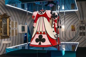
On April 5, 2018, ACMI opened Wonderland, an exhibition that celebrates the screen history of Lewis Carroll’s stories—Alice’s Adventures in Wonderland (1865), Through the Looking-Glass, and What Alice Found There (1871). This was the first major exhibition developed in-house since CEO and Director Katrina Sedgwick joined ACMI in 2015, and it was used as a test bed for developing a new visitor experience for the whole museum. Wonderland began as an exhibition exploring the development of visual effects in cinema and eventually pivoted to exploring these themes through the lens of Lewis Carroll. The exhibition was open at ACMI in Melbourne for six months, closing October 7, 2018. It was then rebuilt to tour with Singapore as the first venue on a multi-year international calendar.
The exhibition experimented with a number of new technologies and working methods. Rather than working with a specialist exhibition designer, ACMI hired theatre designer Anna Tregloan who worked closely with an in-house team of curators, exhibition designers and builders, experience designers and three local interactive agencies. The resulting product was a heavily theatrical exhibition in which objects played a central role but were embedded within a series of sets complete with hidden doors, hidden drawers, and even an (unannounced) alternate reality game.
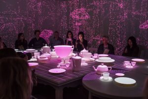
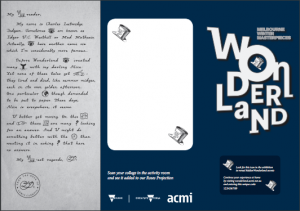
The Lost Map of Wonderland was designed as the visitor’s companion device throughout the exhibition and is designed to be integral to the exhibition experience — in-gallery and at home after your visit. Coupled with a projection-mapped Mad Hatter’s Tea Party immersive, an interactive digital paper craft activity room, and a 15-screen video essay finale, the map formed the connective digital spine throughout the exhibition.
The Map
Sandpit—one of the residents in ACMI’s co-working space and creative incubator, ACMI X worked with ACMI staff to conceive the Lost Map of Wonderland experience which included the map design visitor experience as well as the underlying technology. Sandpit had recently completed the Story of Lamp—a short NFC-based treasure trail at Arts Centre Melbourne (Sandpit, n.d.) and Wonderland was an opportunity to build on this and extend it for a larger experience.
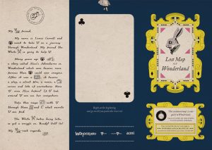
Because the exhibition was designed to be heavily experiential and maze-like, full of surprises, the map was designed to reference the materiality of Carroll’s books. Paper was an ideal, cheap medium, and the idea of bringing a paper map to life during the visit was settled upon as a simple, tangible, and easy way forward. In the end, four different map designs were created representing four key characters in the stories.
The map’s primary purpose was to reveal “hidden” animations throughout the exhibition. There were also symbols on the map to discover character-specific content related to each specific map design. The map also hinted at additional curatorial information for fans, delivered basic wayfinding, exhibition branding, a post-visit call to action and special code, character representation, personalised projection triggering, visitor tracking and even a series of hidden riddles for the most curious to solve! The “back” of the map also doubled as the canvas for visitors’ creations in the activity space.
Find the Lost Map of Wonderland from video by Seb Chan on Vimeo. (https://vimeo.com/312429937)
The Map Design
The graphic design of the map was inspired by The Jolly Postman (https://en.wikipedia.org/wiki/The_Jolly_Postman) by Janet and Allan Ahlberg, S. by Doug Durst and J.J. Abrams (https://en.wikipedia.org/wiki/S._%28Dorst_novel%29), and the Serio-Comic War Map For The Year 1877 (https://digital.library.cornell.edu/catalog/ss:19343682). All of these make use of the printed form and embed secrets and curiosities in them to reward the reader’s curiosity.

Figure 3: Sandpit worked with graphic designer Nick Lewis to design the inside of the map.
Each “country” on the map represents a room in the exhibition which, in turn, represents a key moment in the stories. The map is neither to scale nor does it represent the layout of the exhibition. The only navigation tools are the arrows leading the visitor from one room to the next, indicating the order in which a visitor encounters the rooms.

There are four different character maps to give a personalised experience to audiences. These were designed to be given to specific audience groups rather than randomly:
- White Rabbit (0–8 yrs/families)
- Cheshire Cat (8–15 yrs)
- Queen of Hearts (15+ yrs)
- Mad Hatter (18+ yrs)
- Families — White Rabbit and Cheshire Cat
- School groups — depends on age but give them all the same map
- Group of Adults — try and give each person a different map, except White Rabbit (can share and discuss different content they receive)
The “Rest” of the Map
During the exhibition visit, the back of the map is used by visitors to trigger specific animations, and in the “The Queen’s Croquet Ground,” the back panel of the map is used as a crafting surface before the visitor’s creation is brought to life digitally, projected on a large wall. This room and its interactions were produced with Mosster Studios, also residents at ACMI X.


Initially the plan was to include the usual exhibition marketing and visitor guide details like where the toilets are, what related talks were on, prices, opening hours. But instead, it was agreed that the map should feel special and be exhibition specific with content to delight and surprise throughout the exhibition experience.
At first, the design team tried integrating the map into the rest of the campaign and applied the exhibition visual identity to the cover, so there was consistency across marketing outputs to increase the brand awareness.
However, the purpose of the cover was to tell the visitor what this was, what to expect when they opened the map and a bit about how to use it. In the absence of visitor services officers (VSOs), the map had to do very basic onboarding. And importantly, the visitor was already in the exhibition, so the map did not need to carry the same aesthetic, it was more important that it felt like part of the “Wonderland world” they had fallen into. The first design looked too much like a brochure, and visitors—not interested in promotional material—would disregard it and not use it.
A new design , pulling the ornate design motif from the map inside and putting it on the cover , was made.
Since finalising the map for opening, three further design iterations were undertaken. The subsequent changes made might appear subtle but made tangible improvements to the visitor experience and are fleshed out in more detail later in the paper.
Making the NFC readers
For the maps to operate, NFC readers needed to be designed and built—and integrated into the overall design of the exhibition and visitor flow. Working with Sandpit’s design team, we created several paper prototypes of the readers purely to assess visitor engagement and to refine the physical UX of the interaction. We discovered very quickly that less was more in terms of instructional information. Visitors tended to become confused or tune out if there was too much description of what they had to do. This resulted in a brief instruction provided both verbally by VSOs and a simple visual cue printed both on the map and the readers themselves.
The NFC readers evolved Sandpit’s existing hardware from their previous work to suit Wonderland’s requirements. Firstly, the readers needed to recognise the different map types in order to trigger the correct projection—so that, for example, a White Rabbit map would trigger a projection of the White Rabbit. The system also needed to recognise where in the exhibition the visitor was in order to trigger the projection in the right sequence. The major technical constraints were that different exhibition fabricators would be creating each station—meaning an unreliable thickness of material the NFC tags had to read through, and the possibility of a high amount of electromagnetic radiation present in the ACMI gallery which is (conveniently) situated above a subterranean train line.
The stations were rigged with custom hardware and antennas which allowed Sandpit to “tune” the hardware to overcome these constraints on a case-by-case basis. This was achieved by building several hardware prototypes that were thoroughly tested on site. The hardware also connected to Sandpit’s backend system which recorded each map’s unique ID, along with the date/time of the interaction, allowing us to capture over two million individual data points over the six-month run of the exhibition.
Preparing the Visitor Services Team for Map Onboarding
For the map to be a success and the exhibition to meet its ambitious visitation targets, the onboarding of the map needed to be both quick and effective. Learning from some of the documented experience of the onboarding work done to enable the success of the Cooper Hewitt Pen (Shelly, 2015), the experience team did a series of workshops with our visitor services colleagues including some role playing and prepared the key points for an onboarding script. There was a mutual understanding that there was flexibility around how this was delivered as some staff were willing to be more theatrical than others.
Testing Capacity and Visitor Flow
During the exhibition previews, we tested how we would let people into the exhibition and onboard them with the map and make a plan for opening night and the first day of the exhibition to tweak as we needed to. We knew the ticket capacity for every 30 minutes, and we estimated that the time spent in the exhibition for a visitor would be around an hour.
Initially, we wanted every individual to be onboarded separately. This wouldn’t work for the opening night with large numbers of people going in at once, so we worked out a method for onboarding guests in groups. For opening night, we had three VSOs stationed at the bottom of the stairs and one VSO in the centre of the steps shepherding guests into the three groups. Armed with a pile of maps, VSOs did the onboarding to groups of six to eight and then sent people through into the next room of the exhibition.
Issues Identified the First Days of Opening
Visitor Onboarding — Too Much Too Soon
This high-volume attendance of an opening night is not like any other day of an exhibition. It revealed some issues we needed to communicate at onboarding, adding more detail and complexity to the script.
These included new messages that needed to be communicated to visitors:
- “Close all doors behind you.” This was important to manage visitor flow and expectations in the first section of the exhibition.
- “The more curious you are, the more you’ll discover.” To motivate people to open every door and drawer to find out more, as there were a lot of surprises hidden in plain sight.
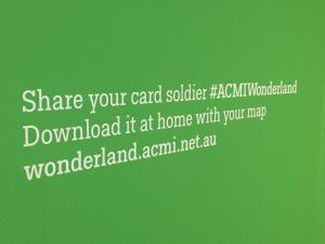
- “There’s more to do at home, so keep your map.” There’s a post-visit website, the experience doesn’t stop at the end of the exhibition!
With the number of people wanting to experience the exhibition far exceeding initial opening-week expectations, we couldn’t keep up communicating our onboarding messages to every visitor. It was too long so we cut it back to the key messages:
- How to find the animations at scanning stations.
- Look out for the symbol.
- There’s an online experience afterwards.
We also rostered on another VSO to do the onboarding to get people through faster especially at peak times — school holidays and weekends.
Confusion with the Initial Map Design— What Symbol Does What?
Visitors were confused by the two main purposes of the map. Match Alice’s top and bottom to reveal the animations at the stations, and look for the symbol on the front of your map to find extra content related to your character.


The problem was the microcopy on the map said, “Place it down on this symbol to find hidden surprises.”
This led to visitors trying to use their map to interact with the character symbols around the exhibition. While this was entertaining (visitors tapping their maps onto objects low to the ground or hidden behind a nook), we needed to clear it up without making too many radical (and expensive) changes to either the map or the exhibition panels.
It didn’t help that the character symbols looked like stickers. Put that together with what looks like a treasure map, and we had some visitors even peeling off what they thought were sticks from displays in order to collect them!
To solve these issues we removed the character symbols on the stations. And, in the next print run of maps, we changed the text on the front of the map to say, “Look for this symbol to discover more.”
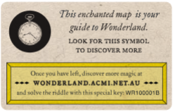
A third version was amended again to make it clearer that the symbol was related to the instructional text. We did this by making the two sentences in the same font. One of the things that slipped through the early rounds was that the visit codes were unnecessarily long, each extra character reducing the likelihood of visitors entering it correctly, so we spent a little effort to encode and shorten them.

Not Your Conventional Room Guide: Challenges Integrating the Map into a Low-light Gallery
The map is very detailed with a lot to read and discover. Early on, we got feedback from some visitors that the text was too small, and in the low lighting in the gallery, it was difficult to read. And some visitors felt disappointed that they couldn’t “finish it all.” To allow visitors to spend more time looking at the map, we put in additional seating and talked about putting some oversized armchairs and gooseneck lights.
The map was designed to be a guide through the exhibition but also suggest that there’s more to discover at home online, as well as a hidden riddle to solve. Even though it was mentioned during onboarding, in speaking to visitors at the end of the exhibition, they often didn’t know there was more to do with the map.
Instituting consistency in a busy visitor services team was also challenging. VSOs have immediate and pressing concerns with visitors as they arrive and move through the galleries — and the post-visit website is understandably quite far down their priority list.
Interestingly, making a map for visitors brings other staff expectations — there were some internal anxieties about not signalling the toilets on the map and whether the exhibition design include directional signage. We decided against complicating the map, and in practice, this didn’t cause any issues—but this is an important lesson for institutions who often overthink visitor needs.
Offshore Production
The production of the maps was only cost effective using a printing company in China. Each map needed to be printed, have a specific NFC tag attached to the front, and then have the post-visit access code tied to the NFC tag printed on top.
The unit cost ended up being AU$.30 (US$.21). This included full-colour, double-sided printing and the NFC integration as well as delivery. This was bundled into the exhibition ticketing cost.
For the final order of maps, we split out the mode of delivery so we got the first batch (20,000) early by air and the bulk of the order (50,000) delivered by sea. Production time ran to four weeks, plus delivery including turnaround time on proof approval — approximately five weeks in total by air, approximately seven weeks by sea to arrive in the country. As a back up, we worked with a local supplier to produce an additional 10,000 to get us over any short falls caused by delay of sea delivery and if we needed an express print run toward the end of the exhibition to get us over the line.
Despite planning, getting the right mix of map designs for visitor types proved difficult. Rather than ordering equal quantities of each design, we made the first order of maps 50% White Rabbit and 16% of Cheshire Cat, Mad Hatter and Queen of Hearts. Because of school groups coming through, we thought we needed extra Rabbits. It was soon obvious that the content of the Cheshire Cat map was appropriate for schools, so we ended up with only White Rabbits leftover.
For the second order, we reduced the White Rabbits to 40% and ordered 20% of the others and finally ended up ordering a 25% split across the four characters. Because of the popularity of the exhibition, we ran out of maps much faster than we had planned for.
This emergency situation forced us to find a local provider to help with supply and as a back up, if we had a run on them again. Production costs increased significantly by using local suppliers, and the inclusion of the NFC tags was not feasible locally. Without NFC, each unit increased to AU$.91 (US$.65) and by the time we added the NFC, it went up to AU$.95 (US$.68) per unit. That is three times the cost of the offshore supplier, but it drastically reduced the delivery timeframe. There was one short period where we had to give out some maps with no chips, which meant visitors couldn’t see the animations or see their digital activity when they get home. We were ready to give out complimentary tickets to these visitors, but fortunately this didn’t come to pass.
The Post-Visit Online Experience
One of the aims of Wonderland was to extend the visit to the exhibition beyond the museum itself—and get visitors to experience it on the way home from the museum or later on. For most media in late 2010s, this is normal behaviour but not yet for museum visits, which are usually considered by visitors as “leisure outings” rather than “media experiences.”

There are hundreds of films, TV shows, and advertising that use the tropes of story of Alice in Wonderland, and the ecosystem surrounding the characters and stories is vast.The post visit experience—along with the print exhibition publication—was a chance to have a curated online space to “exhibit” and discuss more of this content and stories.
When embarking on the journey to design the post visit experience, we looked to what other museums had been doing. We met with teams at Mona to talk about The O (https://mona.net.au/museum/the-o, 2010), Auckland Museum to discuss Volume: Making Music in Aotearoa (http://www.aucklandmuseum.com/visit/exhibitions/volume-making-music-in-aotearoa, 2017), and we talked a lot about The Pen from Cooper Hewitt (2014). Right next door to us, the Australian Music Vault had just opened (https://www.australianmusicvault.com.au/, 2017) as well (Parry, 2018). What we learnt from our discussions greatly informed the design of the experience and our targets around visitation and engagement.
For visitors, logging in to the post-visit experience allowed them to find the card soldier that they have created in “The Queen’s Croquet Ground” for download, the animations revealed at the scanning stations, images of character-related works from the exhibition, wall texts, links to watch some Alice in Wonderland films and links to oodles of related content, including the original manuscript at the British Library. There was also a video essay to watch about how Alice is interpreted on screen and a “making of” video about the exhibition.
Watch Who Is Alice? Curious interpretations of Wonderland from ACMI on Vimeo (https://vimeo.com/262927091)
As with a previous ACMI exhibition, The Nightingale and The Rose (Paterson, 2016), there was a lot of discussion internally about whether to include the related film screenings, talks program, and workshops onto the site, but we decided to keep the post-visit experience purely about the exhibition — and should visitors want to find out more about specific events they would visit the rest of the ACMI website.
There were many questions we wanted answers to relating to the post-visit experience, particularly “how might we best motivate visitors to engage with a post visit website?’” For previous exhibitions, we have experimented with different ways to get visitors online afterwards. For The Nightingale and The Rose (2017) exhibition, we integrated the online exhibition by putting the call to action with the URL on wall at the exit and producing a takeaway card asking visitors to “continue the journey online.” For the Scorsese (2016) and Wallace & Gromit and Friends: The magic of Aardman (2017) exhibitions, we opened up the audio guides so the content could be enjoyed outside of the museum and designed the content in such a way that did not artificially limit it to in-gallery use only. With ACMI undergoing a major building renovation in 2019-2020, Wonderland was a great platform to do some post-visit experiments.

The visitor journey map for the exhibition outlined the touch points at each stage, the systems we used to gather the data and the questions we had. We worked with our colleagues in both brand & marketing and visitor services teams to do audience research and analysis of visitor behaviour, so we could test different approaches to understand what worked best. We focused on the first six weeks from opening day.
The Key Findings of Our Map Research
Of the 94% of visitors that got a map (families often chose to share):
- 87% tapped on more than one scanning station.
- 9.4% visited the post-visit website with 7.2% making it past the login page (based on unique page views).
- 55.5% of those got to the very end of the website (4% of exhibition visitors).
- The most popular content was the Making of Wonderland video at the end of the website with 6,876 users watching all 8 minutes of it (77%).
- Unique clicks to external pages: 8,921. The most-clicked-on page was the ACMI Ideas article “Reverent fidelity: Early adaptations of Alice” with 754 unique clicks (https://www.acmi.net.au/ideas/read/reverent-fidelity-early-alice/).
- Post-visit website visitation followed the same pattern as exhibition visitation — higher at weekends, public holidays and late night events.
The scanning stations tapped the most were the more visually obvious stations and the ones that are more easily accessible when there are large crowds.
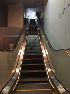
The average visit duration from onboarding to the final scan of the map in the “Queen’s Croquet Ground” was 47 minutes (standard deviation 27). Estimated total visit time 57 minutes. (In order to calculate the time spent in the last two areas of the exhibition after the “Queen’s Croquet Ground,” we observed visitors over an afternoon making their way from the Croquet Ground to the escalator at the exit of the exhibition, and it was an average of 10 minutes.)
Average time spent on the post-visit website (logged in) was 8 minutes 37 seconds, bringing the average exhibition experience time up to 1 hour 5 minutes and 37 seconds.
Different Approaches to Communicating the Post Visit
On the Map
The original map design had the post-visit call to action on the front cover. This was so that visitors that collected the map as a souvenir of their holiday and leave it on the coffee table back at home would easily “see” the prompt for the website login. Through the run of the exhibition, we learned that having it on the back of the map might be better.
68% of visitors spent up to 30 minutes in the “Queen’s Croquet Ground,” designing a soldier on the back of their map, which would give them plenty of time to also take in a post-visit message. Also, being on the back made sense for the order of the journey through the exhibition. Because Wonderland is touring internationally, we have the opportunity to explore the effects of a position change.
At onboarding
Right at the beginning of the exhibition — when a VSO is welcoming you into “the world of the exhibition’” is the most effective way to prime visitors to expect post-visit content. The threshold to the exhibit is one of the few moments where visitor preconceptions can be reset. Interestingly, we discovered that Monday, Tuesday and Wednesday were the most visited days to the post-visit website. Our visitor services colleagues confirmed this was partly because the gallery was quieter, so VSOs had more time to tell visitors about all of the experiences at onboarding.
In Queen’s Croquet Ground
Because of the correlation between post-visit activity and intensive VSO staffing and personalised visitor attention, we focused on deploying targeted messaging at the moments where visitors were investing most time using their map—the “Queen’s Croquet Ground.”
Here, we had an opportunity to add signage about how to claim your soldier later to share it. Auckland Museum’s experience of Volume (https://www.youtube.com/watch?v=DjZWhXk6YAI) — and at Cooper Hewitt — the most popular motivator for visiting a post-visit website was if it contained content that visitors created themselves. In talking to visitors to Wonderland, they had the same to say and intended to download their soldier. This signage was intended to be used as scaffolding for the verbal messaging by VSO staff.
At Exit
From earlier experiments in the Scorsese, Aardman, and Nightingale and the Rose, we knew that giving visitors a reminder at the exit had significant cut through. Internally, however, in the exhibition design, there was other promotional and credit messaging that needed to use this space, and there wasn’t another appropriate wall for it. Visitors exited the exhibition using a long escalator, and we really wanted the post-visit signage to be before they emerged in our main foyer, so they were still in the “exhibition world.” We eventually put signage on the escalator using the same technique that shopping malls and airports use. Turns out, there is a monopoly in Australia on “escalator signage” for the particular brand of escalator in the museum, so it was an unexpectedly expensive task! We did not notice an increase overall of website visitation after it was installed, but when we talked to visitors, they did remember seeing it.
Effects on Dwell Time
We spent time observing when visitors were looking at their maps in other areas around the museum too. Not surprisingly, visitors did this mostly in the cafe and in the foyer spaces as they were waiting for friends and family to arrive. ACMI has a practice of designing “cafe table talkers” for each exhibition, so with the following exhibition opening, Zanny Begg: The Beehive, which overlapped with Wonderland, we designed a new set to include the Wonderland post-visit experience. This cross-exhibition messaging is a new step.
Conclusion
The introduction of any new technology in an exhibition experience requires on-the-floor staff to be brought into the process, clearly briefed and worked with following opening to improve the experience—both operational and content (where possible). Our experience with Wonderland also demonstrates that even with deep integration into the exhibition design process at an early stage, further remedial work will need to be done—and funded throughout the run of the exhibition. Because this remedial work is often in response to unexpected visitor behaviour and might occur outside the footprint of the exhibition itself—signage changes, marketing changes, wayfinding changes—this often falls between the cracks of different “visitor-facing teams.” Designing with this in mind requires an organisational tolerance of working across team boundaries.
Extending the exhibition experience for visitors beyond an exhibition visit is not expected by visitors. This experiment and the success of other institutions approaches have proven the extra content is popular with our audiences, however, it requires deep integration into the overall museum experience. Museums can leverage this more by sharing their curatorial view in new, richer, deeper, ways—and working with visitor-facing teams to ensure it is communicated effectively.
Visitors loved the “personalised” maps, and their paper physicality made them attractive souvenirs as well as “useful” technology.
Visitors who enjoy interacting and creating content want to share it later with family and friends. Museums need to make sure interactive-making experiences are downloadable and also useful. The Cooper Hewitt’s decision to make 3-D models and vector files — not just .jpegs — downloadable from their interactive experiences is instructive in this regard too (Chan & Cope, 2015). This differs from the traditional “rollercoaster photograph” memory approach used by a lot of popular commercial touring exhibitions.
To have real impact—and sustained success—an experience like this can not be confined to the footprint of the physical exhibition. There should be an integrated approach across all business units—end-to-end product and service design.
Acknowledgements
An early version of this paper appeared as a mid-exhibition blog post on ACMI Labs. Thank you to Dan Koerner and Sandpit, ACMI staff—particularly Shelley Matullick, Chris Harris, Jess Bram, Sarah Tutton, Andy Serong, Britt Romstad.
References
Baldwin, T. and L.T. Kuriakose (2009). “Cheap, Accurate RFID Tracking of Museum Visitors for Personalized Content Delivery.” In J. Trant and D. Bearman (eds). Museums and the Web 2009: Proceedings. Toronto: Archives & Museum Informatics. Published March 31, 2009. Consulted January 7, 2019. Available at: http://www.archimuse.com/mw2009/papers/baldwin/baldwin.html
Chan, S. and Cope, A. (2015). “Strategies against Architecture: Interactive Media and Transformative Technology at the Cooper Hewitt, Smithsonian Design Museum.” Curator, 58: 352-368. Available at: https://doi:10.1111/cura.12118
Ciolfi, L., and M. McLoughlin. (2011). “Physical Keys to Digital Memories: Reflecting on the Role of Tangible Artefacts in Reminisce.” In J. Trant and D. Bearman (eds). Museums and the Web 2011: Proceedings. Toronto: Archives & Museum Informatics. Published March 31, 2011. Available at: http://conference.archimuse.com/mw2011/papers/physical_keys_digital_memories
Flack, A. & Patchett, M. (2014). “Curpanion: RFID in Museums and Galleries: A Review.” Available at: http://old.react-hub.org.uk/objects-sandbox/projects/2014/curpanion/journal/rfid-in-museums-and-galleries-a-review/
Hsi, S., & Fait, H. (2005). “RFID enhances visitors’ museum experience at the Exploratorium.” Communications of the ACM, 48(9), 60. Available at: doi:10.1145/1081992.1082021
Northernlight. (n.d.). “RFID ring for Media Experience.” Available at: https://northernlight.nl/project/dutch-institute-for-sound-and-vision/
Parry, M. (2018). “The Australian Music Vault” (Review). Available at: https://medium.com/@vaguelym/the-australian-music-vault-191bf5c9ec3a
Paterson, L. (2016). “Making the Nightingale and the Rose exhibition web presence.” Available at: https://labs.acmi.net.au/nightingale-and-the-rose-exhibition-long-form-bc6005334cc7
Ray, B. (2011). “Museum gets free NFC phone-tap exhibit cards from Nokia.” The Register. Available at: https://www.theregister.co.uk/2011/08/17/nokia_nfc_london/
Sandpit (n.d.). “Arts Centre Melbourne—The Story of Lamp.” Available at: http://www.wearesandpit.com/work/the-story-of-lamp/
Shelly, K. (2015). “When the optimal interface is paper: improving visitor information.” Available at: https://labs.cooperhewitt.org/2015/when-the-optimal-interface-is-paper-improving-visitor-information/
Cite as:
Chan, Sebastian, Paterson, Lucie and Paterson, Lucie. "End-to-end Experience Design: Lessons For All from the NFC-Enhanced Lost Map of Wonderland ." MW19: MW 2019. Published January 20, 2019. Consulted .
https://mw19.mwconf.org/paper/end-to-end-experience-design-lessons-for-all-from-the-nfc-enhanced-lost-map-of-wonderland%e2%80%8a-2/