
The Met’s Object Page: Towards a New Synthesis of Scholarship and Storytelling
Elena Villaespesa, Pratt Institute, USA, Madhav Tankha, The Metropolitan Museum of Art, USA, Bora Shehu, Metropolitan Museum Of Art, USA
Abstract
The Met’s "object page" is the first touchpoint for over 70% of the visitors to its online collection. The user journey to this experience and throughout it has many permutations and goals. Users come from a variety of sources: search engines, social media, other websites, and are greatly diverse in their motivations and familiarity with art. The 450,000+ Object pages are a testament to the encyclopedic nature of The Met itself—offering a great breadth and depth of meticulously cultivated information and highlighting the connectivity of cultures and multiple interpretations of the objects it exhibits. The objects themselves span a dizzying array of media: painting, sculpture, manuscripts, jewelry, coins, tapestry, baseball cards, furniture, musical instruments, and more. A significant challenge clearly arises: how to display all of this ever-expanding information to tell the story of the artwork in a manner that is authentic, comprehensive, accessible, and inspiring to all users—whether academic or casual browsers—across devices. As museums try to define their existence in the digital space, how does the object page contribute in projecting The Met’s voice and expand its outreach beyond the museum’s walls. To achieve this end, the digital team at The Met conducted extensive qualitative and quantitative tests on the pages to gauge users’ online behavior, interests, expectations, and frustrations, across user segments and devices. The methods and tools used included web analytics, heatmaps, user testing (both remote and face-to-face), surveys, user interviews, and A/B testing. This paper will present the findings about the user expectations, preferences, and behaviors on the object page as well as a discussion of the benefits and challenges of the methods used to collect and analyze the data.Keywords: UX research, Analytics, Usability testing, Evaluation, Collection, User-Centered Design
Introduction
The Met’s online collection spans over 450,000 objects. These objects make up the bulk of The Met’s website and are also the first touchpoint for over 70% of the visitors to its online collection. The digital department at The Met has, therefore, been engaged in a continual process of research and iteration on these key pages.
The goals of this initiative were:
- To understand the different types of users coming to the online collection and identify their browsing patterns, goals, and points of frustration.
- Evolve the presentation of the object pages to be more accessible to each of the different audiences coming to the site, and to better encourage deeper exploration of the collection.
The team had a few tentative hypotheses at the outset—that the page was quite long, and the amount of scrolling involved might reduce engagement with elements further down the page; that the layout of the page relied too heavily on expandable accordions, which was suppressing imagery, audio content, and related articles that users might be interested in (see initial design of the object page in Figure 1).
This paper presents the findings around the goals mentioned above, the future evolution of the page in response to these findings, as well as a discussion of the benefits and challenges of the methods used to collect and analyze the data.

Website User Experience Research in Museums
Understanding who visits the museum website has been investigated both by researchers and practitioners, the latter with the immediate goal of improving their digital products and showing the impact of their initiatives. The majority of studies on museum website visitors have been quantitative, with the usage of web analytics as the main method to gather and analyze the data. Google Analytics is a widely used tool in the sector (Finnis, Chan & Clements, 2011; Moffat, 2017). Web analytics tools are inexpensive and collect a vast amount of “clickstream” data. However, these tools have some limitations. They collect people’s actions, but in many cases, need other information to understand the full picture of the user experience. Peacock and Brownbill (2007) proposed that museums move away from using Google Analytics as the default measuring tool and suggested other methods such as surveys, observations, usability testing or interviews with users to understand the whole experience. Kabassi’s (2017) comprehensive review of empirical and inspection methods applied in museums captures the variety of scope, depth, focus, and methodology, concluding on the importance of evaluation to improve the museum website. In a multifaceted evaluation approach, MacDonald (2015) proposes a rubric to assess online collections by using ten dimensions, such us interface usability, personalization, usefulness of metadata, openness, or visual aesthetics, among other aspects of the user experience. This holistic evaluation would require a diverse range of methods to collect the data.
Understanding websites, specifically online collection users, is becoming increasingly important for museums of all ranges to satisfy their users and provide engaging digital experiences. In one of the first in-depth studies of users’ information needs and expectations, Marty (2008) found that museum websites are part of people’s daily lives and that users expect museums to create unique online experiences different to the onsite visit. However, not all website users are the same, and this fact has led to the classification of users into groups based on specific variables to better satisfy their needs. In 2009, John Falk provided a model that has become a well-known reference to understand why people come to museums and the context for meaning creation that results from the visit to the museum. Falk defines five types of motivations to visit a museum: explorer, facilitator, experience-seeker, professional hobbyist, and spiritual pilgrim. The analysis of motivation as a key factor that impacts the experience and defines user segments has been applied for museum websites (Filippini, Stein, & Bowman, 2012; Villaespesa & Stack, 2015; Romeo, 2016; Wambold & Spellerberg, 2018). There are similarities in the motivations identified across these research projects, with some of the key motivations including: researching (within formal and informal contexts), looking for something interesting, and planning a visit.
At The Met, we did a segmentation study with a focus just on the online collection users. Data was collected and analyzed from Google Analytics and online surveys. The six segments that resulted from the analysis are: professional researcher, personal interest information seeker, student researcher, inspiration seeker, casual browser, and visit planner (Villaespesa, 2017). Therefore, there are definitely two extremes in the users’ needs on the online collection: those who come to find in-depth resources for their research and those looking in a browsing mode for content—in many cases visual—that will inspire, surprise, or please them. Figure 2 shows the percentage of visits by user profile on both desktop and mobile devices. Balancing those different type of visits creates a challenge in the design of the object page.

Methodology
The evaluation and user research of redesigning the object page involved a mixed method approach, using both quantitative and qualitative research methods that complemented and informed each other. Due to our iterative approach, the user research and evaluation was not all conducted at the same time. We followed a practice where we improved elements of the page in stages. We focused on the overall experience of the object page and how information is displayed and consumed, gathering insights from several methods such as web analytics and user testing. At times, we targeted a specific feature of the page and collected data to evaluate current usage to test potential improvements through experiments with A/B testing. Table 1 shows a summary of the methods and tools used to redesign the object page. This section describes the data that was available from applying these methods to evaluate the object page along with advantages and challenges.
| Method | Tool |
| Web analytics | Google Analytics |
| Heatmaps and scrollmaps | Crazyegg |
| Recordings | Crazyegg |
| Usability testing (in person) | Lookback |
| Usability testing (remote) | Usertesting.com |
| A/B testing | Optimizely |
Table 1: List of tools and methods used in the evaluation of the object page
Web Analytics
Google Analytics reports website traffic metrics about how many people visited your website, including traffic characteristics, such as: sources, audience profile, user journeys, and content viewed (Clifton, 2010). Based on Google Analytics’ landings page report, we know that 70% of our online collection users land on the object page. This confirms why this entrance point is so important to create an excellent experience and website journey. A major advantage of this tool is that it provides a high volume of data for all website users allowing us to perform a very detailed analysis of user behavior. To take full advantage of this tool, advanced configuration is required. Therefore, Google Analytics was set up to gather data from specific user actions via event tracking (clicks on buttons or links to measure image downloads, usage of zoom options, clicks on related content, shares on social media, among other interactions).
Heatmaps, Scrollmaps, and Recordings
Heatmaps and scrollmaps are visual reports that aggregate the number of clicks and views of each element or section of the page. Based on the volume of clicks and impressions, the tool assigns colors to the components of the page. In our tool, the brighter the area, the more popular it is; the darker the area, the less popular it is (Crazyegg: Snapshots). These reports are helpful to analyze what users pay attention to and which content gets missed. We used this tool to see which were the interactive elements people click the most and also how far people scroll down on the page, both on desktop and mobile devices. For this purpose, we added recordings to the tool mix, which are videos of actual interactions with the website. Watching these videos provides insights into user journeys, scrolling patterns, where people spend time on the page and potential usability issues. While this information is critical to identify pain points, there are some limitations in the interpretation of users’ behavior which take us to the next method.
Usability Testing
In the past year, we have established an ongoing practice in our digital production process to conduct usability testing, either face to face or remotely. Usability testing is a method where participants are asked to perform a series of tasks while they “think aloud,” that is that they express their feelings, opinions, and impressions at the same time they are using the interface (Krug, 2010). We recruited for each test between five and ten participants from the museum galleries and via email which, on occasion, can be very time-consuming. To accelerate the process, we regularly make use of a remote user testing tool which returns fast results, although the main drawback is the inability to follow up on users’ actions or comments (Moran & Pernice, 2018; Usability.gov: Remote Testing).
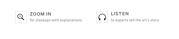
For the redesign of the object page, we applied this method in each of the design stages to understand the current experience and test different prototype versions of the new design. We gauged the hierarchy of content on the object page from a user’s perspective and examined the types of actions users are typically performing on the page, along with any obstacles. Tasks ranged from open-ended activity, exploring the page to complete specific actions (such as zooming on the image), finding more information about an artwork, or consuming specific content, among other tasks.
The nature of the content on the object page presented a challenge to test qualitatively. Qualitative testing delivered the most tangible observations when users were asked to perform discrete tasks (e.g., asking users to enlarge the image, to listen to audio, or to find another artwork by the same artist). In these instances, one could observe the user going about the tasks and clearly identify obstacles they encountered (such as the language not being clear or the element in question not being noticeable enough). Similarly, asking users what content they thought a section would include, or where they thought a link might take them, provided us an idea of whether the language and visual signifiers currently on the page were clear enough.
However, a major part of increasing engagement on the page depended on finding out what content on the page a user found interesting or what related artwork they might be interested in exploring. This type of information was harder to meaningfully elicit. To try and gain a nuanced understanding of this, we made sure to test with a variety of user types: remote, platform-recruited testers were screened to accept testers with some degree of familiarity with art or museums. Interviewing visitors to the museum gave us an idea of how a more casual, visit-oriented user might interact with the page and reaching out to members (many of whom have been associated with the museum for several years), allowed us insight into the more seriously engaged, art-savvy demographic. Finally, we contacted researchers in the museum and asked them to recount the paths they took on the website while conducting their research, which surfaced some highly specific behaviors and points of interest. Casting a wide net allowed us to better gauge what different types of users might find most relevant, but it should be noted that a few dozen qualitative tests will only provide a small window into what is a vast ocean of concerns, interests, and motivations that bring visitors to these pages.
User testing is time-consuming to conduct. For more general explorations on the existing page as well as the successive prototypes, we conducted 10 interviews per round. (5 remote, 5 in-person). For more targeted inquiries on a particular section of the page (artwork details, related content, etc.), we conducted 5 tests per round, focusing on either remote or in-person users, depending on what user type we wanted to target for that round. This was found to be enough to furnish hypotheses that could then be A/B tested.
A/B Testing
As mentioned earlier, the redesign of this page was done in stages by looking at the big picture experience but also examining which small changes could improve user engagement with the page. For this purpose, A/B testing was a useful method to experiment with incremental changes to the page. This method consists of providing two or more versions of the page to users in order to measure which one performs better to accomplish your goal (Siroker, Koomen & Harshman, 2013). The advantage of using this method was that we were able to prove or invalidate our hypothesis of what would work on the page before developing and implementing the changes on the live site. However, challenges of this method lie in the selection of the success metric and in considering all the potential external variables that may impact the test result. Some examples of the questions we tried to answer with A/B testing were: If we add links on the tombstone of the artwork, would traffic increase to other content on the website? Would including promos to the store make sales go up? Which CTAs are better to get clicks on related content? Does exposing some features by default increase interaction?
Results and Findings
Turning now to the application of these methods, this section presents the key findings of the evaluation of the object page along with reflection on how these informed the new design of the page.
Images Drive Engagement on the Page
An unsurprising finding that we see in every one of our conducted user research studies, is that images drive engagement on the object page. From a quantitative perspective, Google Analytics and Heatmaps show that a significant volume of clicks and interactions occur with visual content. Users enlarge the image, zoom into it to see the artwork details, and download it. Figure 3 shows the percentage of users of the online collection that interact with each of the elements on the page. Talking to users during user testing sessions and reading their comments from surveys, gave us more context and feedback about the images on the page and how much value they add to their online experience. Users want high-resolution images, and many of them considered it the most important element on the page. In the current design, people appreciate the large size and focal page treatment it receives, marking that as something to maintain and even enhance.

In a more specific example of engagement with images, we learned from user testing sessions that users really enjoyed seeing more images about the same artwork including details, x-rays, and comparative objects that belong to other institutions. These images were hidden under an expandable “accordion” titled, “Additional images” that users had to click on to see all the images available for the artwork. We decided to expand this section of the page by default. The results were measured using event tracking and heatmaps and showed a significant increase in the interactions. The number of image clicks increased by 450% and the change in the total volume of interactions is very clear on the heatmaps, before and after this design change (Figures 4 and 5).
Crickey! That is good resolution, to be able to zoom in that far. I’ve never actually seen his paintings, really, that close. (User zooming into a Van Gogh painting)


Language Highly Influences How Users Digest the Content
One area where qualitative testing was particularly illuminating was in gauging how clear or confusing users found each of the sections on the page. Meaningful headings and clearly demarcated sections allow users to quickly and easily digest a page and zero in on things that are relevant to them (Nielsen, 2000). Often the language used on pages can reflect institutional or scholarly terminology and may be foreign to many users. As a result, this is misinterpreted or glossed over and causes them to miss content they would otherwise have been interested in (Loranger, 2017). During testing, users were asked to describe out loud what they thought each of the sections on the page were, without expanding or clicking on them. Afterward, they were asked to expand or click on the content, and asked whether the results matched what they had expected:
Ok, so I was wrong about ‘Catalog Entry,’ I thought it was more like . . . when you go to a library, each book is listed. [Here], it’s more like a full description of the painting.
The strongest case in point was in the Timeline of Art History (TOAH) section of the page. TOAH consists of visual essays that delve into the context of the artwork, background on the artist, the art style, time period, etc. Links to these essays are included in an expandable accordion on the page. Before the qualitative tests, a quick A/B test had also been run where this section was expanded by default, but with no measurable improvement. Our thinking was therefore that either most users were not interested in this content or that they were potentially interested but were not noticing it or did not know what it was.

When asked what they thought this section was about, most users did not display immediate clarity (even after the section was expanded, and they could see the links). The section was further divided into “essays” and “timelines,” which users did not understand the difference between and left others wondering if “essays” linked to essays that were written by the artist. It should be noted that after several seconds of (prompted) thought, most users did guess correctly that the section lead to more information about the artist, time period, etc. Our aim, of course, is that this information is communicated instantly and unprompted, through the design of the page. When asked to click in to one of the essays, most users exhibited great interest, even delight, leading us to conclude that this section should be given a greater amount of prominence on the page and be depicted to allow for better representation of the visual nature of the essays (to be demarcated more clearly from the other scholarly, text-heavy content around it), and be introduced through more accessible language, such as “About the artist,” “About the time period,” etc.
This says, ‘Essays’ and ‘Timelines.’ I’m not sure what the ‘Timelines’ mean. Are these his essays? Honestly, I’m not sure what these mean. Maybe these timelines are when he painted?
Besides The Timeline, other frequent terms of confusion were “Provenance,” “Catalog Entry,” “MetPublications” (which is a branded term unfamiliar to most outsiders), and even “Audio,” which several users were unable to immediately guess what exactly the audio might contain. Again, it should be stated that most users came to more or less accurate conclusions about the nature of the content eventually. The test made a strong case for having unambiguous and easily understandable terminology in order to allow users to quickly find pieces of content they may be interested in, without spending several seconds of cognitive overhead per section (Haile, 2014). It is doubly imperative for websites and institutions, that aim to educate, to be able to present information in a way that is inviting and accessible to diverse audiences and encourages exploration.
Layout and Information Hierarchy Affects the Visibility of Content
The current object page layout presents the information in a single column and because of the breadth and depth of content available, a lot of scrolling is required to view it all. Studies show that most users spend most of their time above and immediately below the fold (Fessenden, 2018). Scrollmaps of the object page show the same result, highlighting the importance of choosing which content is placed at the top of the page (Figure 7). Above the fold, the main image and images carousel are displayed with no indication for users that there is more content if they scroll down. Less than a quarter of the impressions happen below the accordion boxes, so related objects and categories are barely seen. On mobile, when the object text is long, users do not scroll down to view other content, missing in particular, the audio content which is relevant during their museum visit.

Observations during user interviews and analysis of click rates on page elements, suggested that the hierarchy of information presented on the page did not always best serve users’ interests and motivations. On the page, artwork details such as medium, date, accession number, dimensions, etc., were promoted above the text describing the artwork, yet many user segments (Personal Interest Seekers, Inspiration / Visual Seekers, and Casual Browsers) tended to scroll past the former and spend more time on the latter. Since the text of the artwork was far below the image, users would go up and down numerous times from the text to the image. Having the image side-by-side with the text could provide a better reading experience as the user could see the artwork images while reading the text.
Similarly, the “categories” section on the page, which contains links to explore more works by the artist, from the time period, of the same material(s), etc., receives fewer clicks compared to the section below it—”Related Artwork.” An A/B test was performed to make the categories section stand out more visually and look more clickable, without any measurable improvement. During interviews, when asked to find works by the same artist, users tended to scroll up the page to the “tombstone” section (presumably where they had first encountered the artist name), rather than down to the categories. Based on this observation, we conducted an A/B test making some of the “tombstone” entries clickable across ten pages (Figure 8). “Artist” was the only term where the hyperlinked tombstone near the top of the page showed a significant increase in clicks over its counterpart further down the page (followed distantly by “medium” and “date”). Based on this test, clearly displayed hyperlinks could increase the click-through rate on the page by up to 2%, which translates to an approximately 52K increase in total page views per month on average. (Note: this does not account for users who may already be viewing works by the same artist through other routes, such as by initiating a search, so the actual increase in pageviews would presumably be lower.)

When asked about other content they might be interested in, users mentioned works by the same artist or from the same art style, meaning works that were explicitly related to the work they had just seen, rather than generally related. Based on this observation and the related A/B tests mentioned above, it seems that suggesting general categories to explore might be more appropriate earlier on in the user journey, such as on the landing page for the collection, and more specific relations are more valuable on the object page.
Surfacing information that is not relevant to users can cause them to leave the page without exploring further. This is a particularly pressing concern for a page as long and as packed with information as the object page. At the same time, unlike professional researchers, who are motivated to seek out particular pieces of information relevant to them, users on the more casual/unfocused end of the spectrum are more likely to drop off before coming across something that is of interest to them. It should also be noted that a higher percentage of casual browsers are on mobile devices (40%, versus 14% for professional researchers), where page length is even more pronounced than on desktop.
It is hoped that by understanding and responding to how users are browsing and what they are looking for (and when), we can reduce drop off and encourage greater exploration of the collection than before.
Related Content Needs Context and Visibility
Users typically view on average 3-5 pages in the collection during their session, and a prime area of concern has been to encourage them to view more. The “related objects” section at the bottom of the page is not a very strong performer in terms of click rates, receiving clicks from about 3% of users. Some of this is presumably due to reasons of page length and hierarchy mentioned above, but a closer look at the data suggests that context is extremely important when it comes to related content. Objects that are part of well-known sets, such as The Unicorn Tapestries, and objects created by well-known artists (Monet, Van Gogh, etc.) that feature related objects by the same artist, see higher click rates on related objects, around 5-7%. It is also likely that more generalist audiences are accessing the more “popular” objects, and are more likely to explore relative to scholarly audiences who are known to use the site in a much more targeted manner. Except in the case of related objects by the same artist, where the connection was easily apparent, some users said they were not sure how exactly the works shown to them were related. Several users said (unprompted) that they would like to see other artwork from the same gallery, indicating that even online users often have a keen sense of the museum as a physical space and are more responsive to the kind of curatorial arrangement found in the latter rather than the algorithmic one.
That’s not giving me a sense of why you’re showing me these other things. Is it artists of the same school, at the same time . . . ?
More tellingly, the related objects section did not actually receive a great amount of attention from users during interviews, even when prototypes were shown which specified the exact nature of the relation. Instead, they seemed more interested in related content that deepened their understanding of the artwork they had just looked at, such as the visual essays from the timeline, video content, and other multimedia features. The learnings were, therefore, not only that this kind of content should be surfaced prominently on the page but also that exploration of the collection is best facilitated by using context and narrative to introduce users to new works, rather than the conventional and e-commerce-like, “related objects” approach.
Interaction with Content Increases with Clearer Labeling and Presentation
The audio content section on the page provides the most pertinent example of the benefits of conducting both quantitative and qualitative testing on a digital product.
Initially, we were unsure whether users would be interested in listening to clips from the museum audio tour while on the object page. The team conducted an A/B test on five pages where the audio section remained expanded by default (Figure 9). On average, audio files on the variants received clicks from 5% of users, compared to 2% for the control pages. Emboldened by the test, a new UI was designed for the audio section, which did not need to be expanded (Figure 10). Audio play rates more than doubled, from around 300-500 plays a day to 700-1,000 plays (Figure 11).


Ordinarily, such an increase in engagement would have signaled the successful conclusion of the intervention. However, qualitative studies indicated that there was still further room for improvement. When asked what they thought the audio section was, most participants found the titles of the audio clips confusing. (In most cases, the audio titles reflect the names of the audio tours the clips are part of or simply the name of the artwork repeated). Qualitative testing further confirmed that users found the audio interesting and relevant. The next design intervention in this section is to convey (more clearly) that users can expect to listen to curators and other experts talk in depth about the artwork and to de-emphasize the confusing audio titles.
From Data to Design
Based on these findings, the following design interventions were identified:
1. Bringing Up Key Information Above the Fold

By displaying imagery and descriptive information above the fold, it is hoped that users will instantly be presented with the information most relevant to them (more casual browsers in particular), who tend to be inclined towards the descriptive text more than the “tombstone” details. This will, in turn, reduce the amount of scrolling necessary to access the sections further down the page, potentially resulting in increased engagement with them as well.
2. Accessible Labeling

By labeling each section and feature for clarity, we expect users (especially more casual browsers) to be able to identify content that may be of potential interest to them more easily and quickly, reducing their likelihood of missing it. Expandable sections should ideally be labeled so that a user knows what they contain without having to expand them.
3. Building a Narrative


Giving the user a clearer idea of what they will get out of the links presented on the page, and giving them more context as to how exactly they are related to the artwork they are viewing, has significant potential to improve engagement. Providing more of these details allows a user to build up a stronger sense of the narrative around a work and is more likely to draw them in to explore further as opposed to more general associations.
Of course, this kind of narrative-building does come up against very real limitations of technology and institutional resources, but we are exploring how the digital collection might be augmented by processes and efforts already underway in other forms throughout the museum.
Conclusion
The digital team at The Met believes in delightful, functional, data-driven design and well-optimized user experience for all users. Likewise, high-quality content that the museum creates and owns, and a great reading experience are both cornerstones that support our belief that storytelling is really important in understanding our objects and their interpretation.
Undertaking this user research helped us to begin to optimize and improve the experience on the object page. The methodological approach taken was mixed as it adopted a combination of both quantitative and qualitative approaches. Quantitative tests proved very helpful when we had a specific hypothesis to prove or disprove. Qualitative tests were helpful for coming up with new hypotheses or to provide clues as to whether our existing hypotheses were sound or not. They helped further flesh out what users were thinking and why they behaved the way they did. Using both types of studies together were essential to gaining a holistic understanding of the people coming to the website.
This is not just the end in our process. As features and functionalities go live, we will continue our evaluation in order to display this ever-expanding information and to tell the story of the artwork in a manner that is authentic, comprehensive, accessible and inspiring to all users.
References
Clifton, B. (2010), Advanced Web Metrics with Google Analytics, Wiley, Hoboken.
CrazyEgg: Snapshots. Available at https://help.crazyegg.com/article/70-snapshot-heatmap-report
Falk, J. H. (2009). Identity and the museum visitor experience. Walnut Creek, Calif: Left Coast Press.
Fessenden, T (2018). “Scrolling and attention.” Nielsen Normal Group. Available at https://www.nngroup.com/articles/scrolling-and-attention/
Filippini Fantoni, S., Stein, R. & Bowman, G. (2012). “Exploring the Relationship Between Visitor Motivation and Engagement in Online Museum Audiences.” MW2012: Museums and the Web 2012: Proceedings. Consulted December 10, 2018. Available at http://www.museumsandtheweb.com/mw2012/papers/exploring_the_relationship_between_visitor_mot
Finnis, J., Chan, S., & Clements, R. (2011). Let’s Get Real: How to Evaluate Online Success? Brighton. Available at http://weareculture24.org.uk/projects/action-research/
Haile, T. (2014). “What You Think You Know About The Web is Wrong.” Available at http://time.com/12933/what-you-think-you-know-about-the-web-is-wrong/
Kabassi. K. (2017). “Evaluating websites of museums: State of the art.” Journal of Cultural Heritage, 24, pp. 184-196.
Krug, S. (2010). Rocket surgery made easy: the do-it-yourself guide to finding and fixing usability problems. Berkeley, Calif.: New Riders.
Loranger, H. (2017) “Plain Language Is for Everyone, Even Experts.” Nielsen Normal Group. Available at https://www.nngroup.com/articles/plain-language-experts/
MacDonald, C. M. (2015). “Assessing the user experience (UX) of online museum collections: Perspectives from design and museum professionals.” MW15: Museums and the Web conference 2015. Consulted December 10, 2018. Available at https://mw2015.museumsandtheweb.com/paper/assessing-the-user-experience-ux-of-online-museum-collections-perspectives-from-design-and-museum-professionals/
Marty, P. F. (2008). “Museum websites and museum visitors: digital museum resources and their use.” Museum Management and Curatorship, 23(1), 81–99. https://doi.org/10.1080/09647770701865410
Moffat, K. (2017). “Analytics” in Hossaini, A., & Blankenberg, N. (eds.). Manual of digital museum planning. Lanham : Rowman & Littlefield, 61-76.
Moran, K., & Pernice, K. (2018). “Remote Moderated Usability Tests: How and why to do them.” Nielsen Norman Group. Available at https://www.nngroup.com/articles/moderated-remote-usability-test/
Nielsen, J. (2000) “Eye Tracking Study of Web Readers.” Nielsen Norman Group. Available at https://www.nngroup.com/articles/eyetracking-study-of-web-readers/
Peacock, D. & J. Brownbill (2007). “Audiences, Visitors, Users: Reconceptualising Users of Museum On-line Content and Services.” In J. Trant and D. Bearman (eds.). Proceeding from Museums and the Web Conference, Toronto: Archives & Museum Informatics. Available at http://www.archimuse.com/mw2007/papers/peacock/peacock.html
Rohrer, C. (2014). “When to Use Which User-Experience Research Methods.” Nielsen Norman Group. Available at https://www.nngroup.com/articles/which-ux-research-methods/
Romeo, F. (2016). “What motivates a visit to MoMA’s website?” Digital @MoMA Medium Publication. Available at https://medium.com/digital-moma/what-motivates-a-visit-to-moma-s-website-ebad33e67ef0
Siroker, D., Koomen, P. and Harshman, C. (2013) “A/B testing : the most powerful way to turn clicks into customers.” Hoboken : Wiley, 2013.
Usability.gov: Remote Testing (2013). Available at https://www.usability.gov/how-to-and-tools/methods/remote-testing.html
Villaespesa, E. (2017). “Who are the users of The Met’s Online Collection?” The Met’s blog. Available at https://www.metmuseum.org/blogs/collection-insights/2017/online-collection-user-research
Villaespesa, E., & Stack, J. (2015). “Finding the motivation behind a click: Definition and implementation of a website audience segmentation.” MW2015: Museums and the Web 2015: Proceedings. Consulted December 12, 2018. Available at https://mw2015.museumsandtheweb.com/paper/finding-the-motivation-behind-a-click-definition-and-implementation-of-a-website-audience-segmentation/
Wambold, S., & Spellerberg, M. (2018). “Identity-related motivations online: Falk–s framework applied to US museum websites.” Journal of Digital & Social Media Marketing, 5(4), 353–369.
Cite as:
Villaespesa, Elena, Tankha, Madhav and Shehu, Bora. "The Met’s Object Page: Towards a New Synthesis of Scholarship and Storytelling." MW19: MW 2019. Published January 15, 2019. Consulted .
https://mw19.mwconf.org/paper/the-mets-object-page-towards-a-new-synthesis-of-scholarship-and-storytelling/